Does the Food Label Need an Update?
Registered Dietician
| 3 min read
The food label is a great way to gain a better understanding about the food you are eating. But does it need an update? As a registered dietitian, I have spent time teaching people how to read food labels properly. I have always thought there has to be a better way to illustrate the nutrients and ingredients of the food that doesn’t confuse the customer.
Points of Confusion
In my opinion, the two most misleading things on the current food label are:
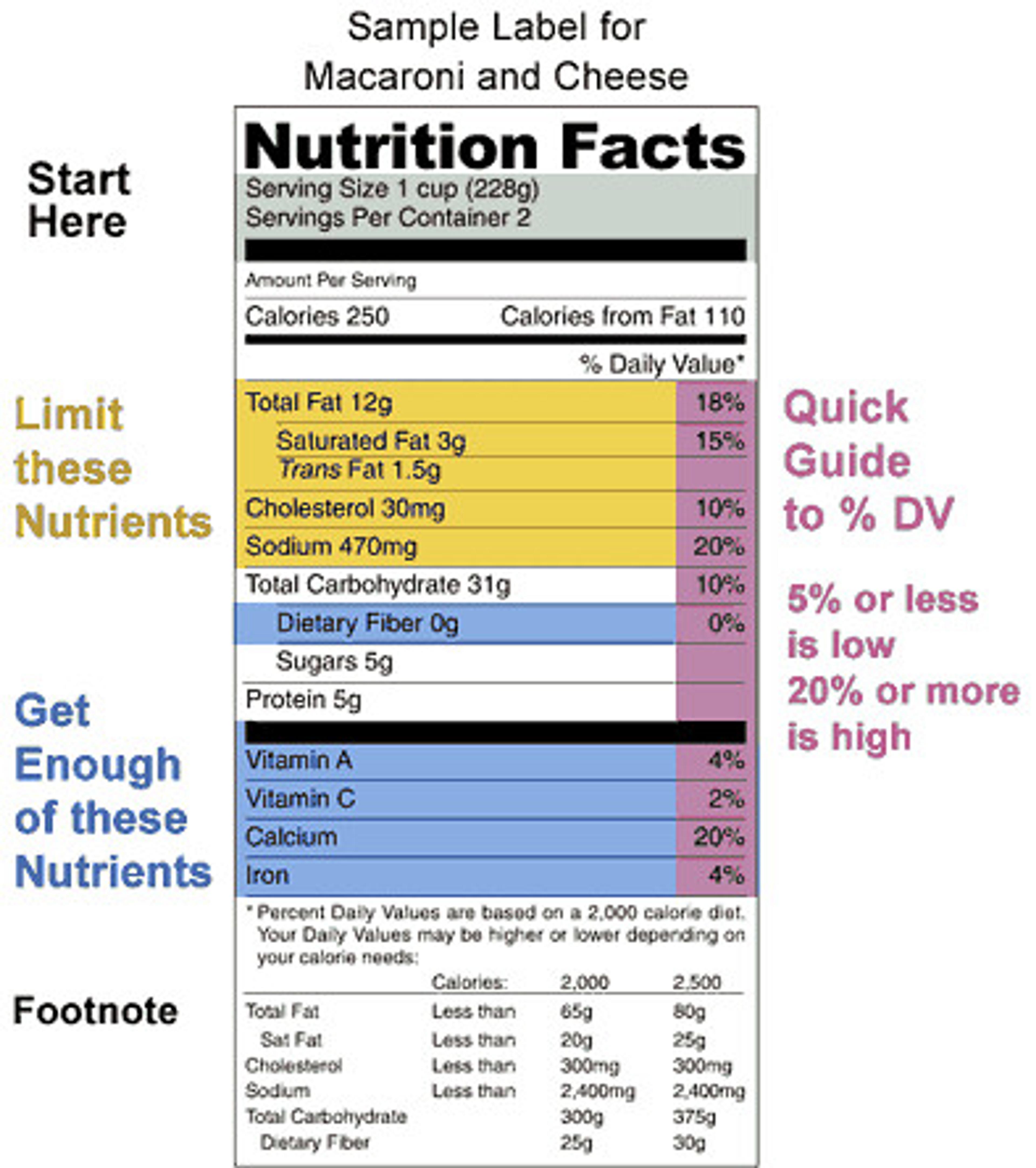
- The serving size versus the servings per container. All the amounts of the nutrients on the food label are based on the serving size. The problem lies in the fact that there may be multiple servings per container, which the consumer must then calculate to determine the proper amount of calories, fat, etc. they are eating. For example, take a look at the macaroni and cheese food label below. If the label uses 1 cup as a serving size and there are two servings per container, then the customer must double the figures of all the nutrients and other ingredients to figure out what they are having if they eat the entire container’s worth of food.
- The percentages found on the right-hand side of the current food label. If you read the fine print on the bottom of a food label you will learn that those percentages are based on a 2,000-calorie diet. The problem with this is that not all people should be following a 2,000-calorie diet. That is more of a calorie count target for a man, not a woman.
Hope for a New Food Label
The University of California, Berkeley recently took on a project to redesign the food label. This project was not an actual initiative to create a new label, but it definitely gives the U.S. Department of Agriculture a lot to consider.
The university had various foodies and designers take a stab at inventing a better, more informative and less confusing food label. A panel of judges included a food writer, a consumer health activist, a pediatrician, a graphic designer and a Belgian design professor.
The winning entry was created by Renee Walker, a visual designer from San Francisco. Her design used colorful boxes in varying sizes to illustrate the proportions of the main ingredients in that food item. Another designer used circles in different sizes to show this same type of concept. Another contender made sure the calories and nutrients labeled on the food item accounted for the entire container and not per serving. It was also color coded using the common red, green and yellow stoplight colors to reflect a similar theme with eating that food. Other competitors used bar graphs and letter grades to indicate a food’s healthfulness.
The judging panel found a lot of great qualities from these submissions, but thought they all needed some tweaking to be ideal. To view more of the nutrition label designs check out Rethink the Food Label.
If you could design a new food label, what would you do? Which parts do you find the most confusing? I would love to hear your thoughts and opinions.
I hope that when they eventually redesign the food label it is easy to understand and highlights healthier foods for the consumer.
Photo Credit: Urban Sea Star and Writing Program PTW